
- Authors

- Name
- Alberto Montalesi
Greenland is not the size of Africa. It is not even close: Africa is roughly fourteen times larger. If that surprises you, blame the map on your classroom wall.
The Mercator projection preserves local angles and shapes, which made it useful for navigation. Its scale increases with latitude, though, so areas near the poles look far larger than they are. Africa is not made smaller on the map; Greenland is made much larger. Map2Maps lets you select a country or draw a shape, then compare the same geometry across several map projections.
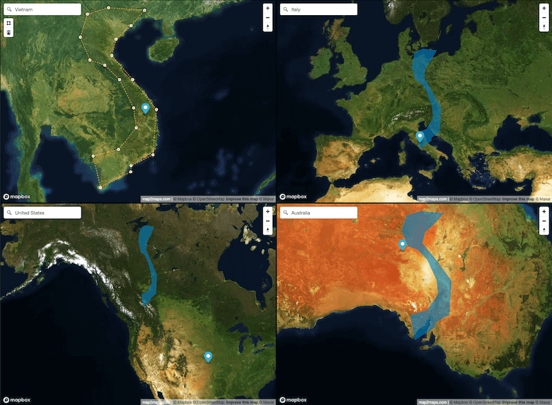
What Map2Maps does
- Compare country sizes by viewing the same country across up to four map projections
- Draw your own shapes and polygons to compare arbitrary areas, not just national borders
- Save and share comparisons when you want to show how a projection changes what a shape appears to be
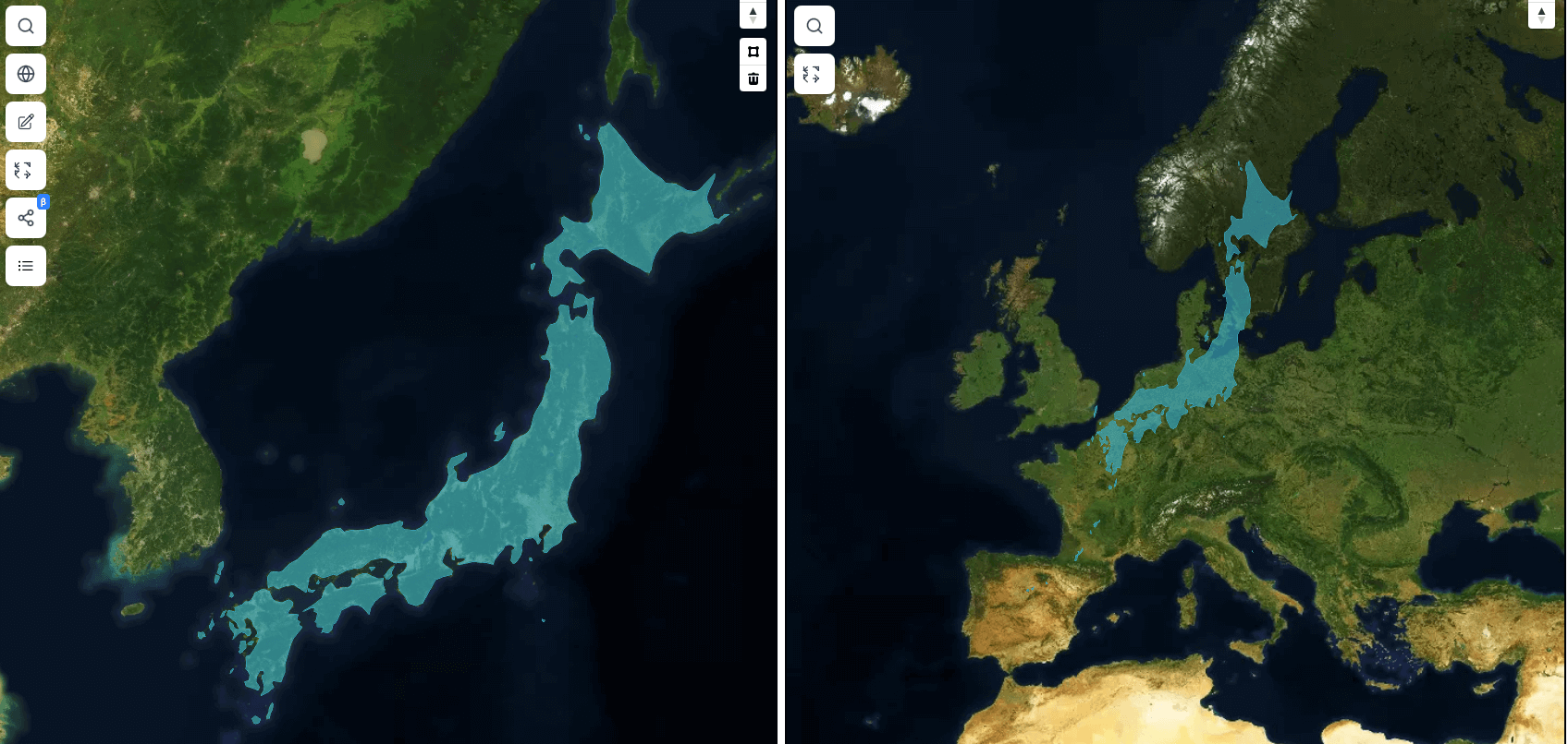
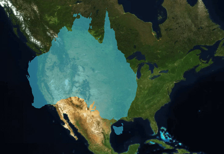
I built the first version in 2020 after having the same argument too many times. A Mercator map gives people a very particular picture of country size. Japan can look compact, while Greenland can look continental. Seeing the same region in a different projection makes the tradeoff obvious.
From Angular to a modern stack: the v2 rebuild
The version online today is a ground-up rebuild, not a patch on the original.
| v1 (2020) | v2 (2023) | |
|---|---|---|
| Frontend | Angular | Next.js + TypeScript |
| Map rendering | LeafletJS | Mapbox GL JS |
| Data | None persisted | PostgreSQL (saved maps, accounts) |
| Payments | — | Paddle |
The rebuild was not cosmetic. Mapbox GL made it practical to render several views at once, and the backend made saved and shared comparisons part of the product.
The area of a country does not change between views. What changes is the projection used to place its coordinates on a flat surface. Map2Maps keeps the selected geometry and redraws it in each view, which makes the projection's effect visible without pretending that one projected outline is the country's literal size.
Not everything here is AI-built
I've written elsewhere on this blog about leaning on AI tools heavily for recent projects like ARCOLOGY and Battle Tanks, so it's worth being precise here: Map2Maps isn't one of those. The core of it was designed and hand-built across several years, long before AI-assisted coding was part of my workflow. Where AI has helped more recently is around the edges of the v2 codebase: cleanup passes, refactors, smaller feature work. A hand-built project with some AI help bolted on late in its life is a different story from an app built AI-first, and worth keeping separate rather than lumping together. This site itself moved off Vercel onto Cloudflare Workers this year, a much more recent and much more AI-assisted piece of work, written up here.
Map2Maps is free to start using at map2maps.com, with premium features available. Compare a country or a shape in a few projections and the limits of the standard classroom map become much easier to see.
Recommended Tools
These are affiliate links. Using them helps support this site at no extra cost to you.
Did you find this useful?
0 readers found this helpful